Free Microsoft Power BI PL-300 Actual Exam Questions
Dumps Box (DumpsBox) offers up-to-date practice exam questions for PL-300 certification exam which are developed and validated by Microsoft subject domain experts certified in Microsoft Power BI PL-300 . These practice questions are update regularly as we keep an eye on any recent changes in PL-300 syllabus, and when there is update our team quickly adjusts the questions. This commitment to providing the best quality exam prep material to certification aspirants is what makes DumpsBox.com the best certification exam prep website. On top of that, our strong, yet strictly moderated, community based feedback keeps the content clean and current. Each question has helpful community discussion that provides it extra perspective and introduces helpful resources for better exam preparation. This also saves students from other outdated practice questions or illicit exam dumps that can have adverse affects on career. Browse through our Microsoft Power BI PL-300 exam questions and pass your exam on first try.
HOTSPOT You have a folder of monthly transaction extracts. You plan to create a report to analyze the transaction data. You receive the following email message: "Hi. I've put 24 files of monthly transaction data onto the shared drive. File Transactions201901.csv through Transactions201912.csv have the latest set of columns, but files Transactions201801.csv to Transactions201812.csv have an older layout without the extra fields needed for analysis. Each file contains 10 to 50 transactions." You get data from the folder and select Combine & Load. The Combine Files dialog box is shown in the exhibit. (Click the Exhibit tab.) 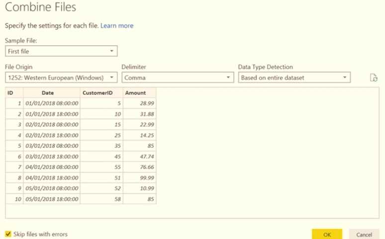 For each of the following statements, select Yes if the statement is true. Otherwise, select No. NOTE: Each correct selection is worth one point.
The preview file is Transactions201801.csv, which has the older layout, so selecting Yes for the statement about using the oldest file as a sample makes sense. The mismatch in columns will affect the combined data.
This one’s pretty confusing without seeing the full file structure and data samples.
HOTSPOT You are creating a Microsoft Power Bl imported data model to perform basket analysis. The goal of the analysis is to identify which products are usually bought together in the same transaction across and within sales territories. You import a fact table named Sales as shown in the exhibit. (Click the Exhibit tab.) 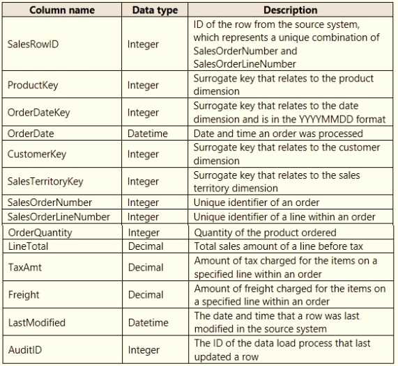 The related dimension tables are imported into the model. For each of the following statements, select Yes if the statement is true. Otherwise, select No. NOTE: Each correct selection is worth one point.
The fact table granularity looks right for basket analysis, so Yes on that.
Yes, the Sales table has the needed granularity to track product combos per transaction.
DRAG DROP You need to create a date table in Power B1 that must contain 10 full calendar years, including the current year How should you complete the DAX expression? To answer, drag the appropriate values to the correct locations. Each value may be used once, more than once, or not at all. You may need to drag the split bar between panes or scroll to view content NOTE: Each correct selection is worth one point. 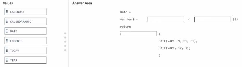
I’m thinking the start date should definitely be January 1 of (Year(Today()) - 9) because that covers the full 10 years including this year, and the end date should be December 31 of the current year.
I see why some are unsure about the direction, but since it says “10 full calendar years including the current year,” I’d go with starting from January 1st of 9 years ago up to December 31st of the current year. That way, you get a total of 10 full years. So for the DAX, using something like STARTOFYEAR(TODAY()) minus 9 years for the start date and ENDOFYEAR(TODAY()) for the end makes sense. It covers the full span and includes the current year without going into the future.
DRAG DROP You have the line chart shown in the exhibit. (Click the Exhibit tab.) 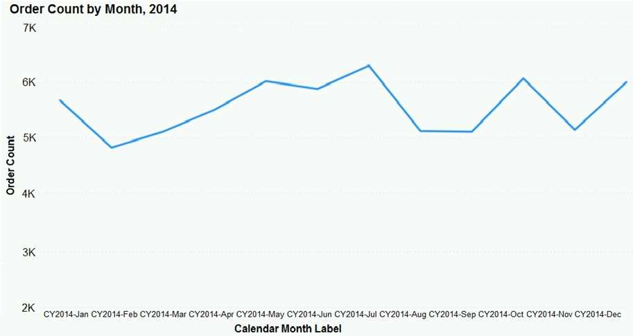 You need to modify the chart to meet the following requirements: Identify months that have order counts above the mean. Display the mean monthly order count. Which three actions should you perform in sequence? To answer, move the appropriate actions from the list of actions to the answer area and arrange them in the correct order.
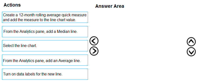
Starting with D to create the mean measure is a must since you need that value for the rest. Then A to display it visually, and finally C to highlight the months above that mean makes sense.
I’m thinking the key is to actually create a mean measure first, which would be option D. Without that, you can’t highlight months above the mean correctly or add a dynamic line. Then adding the mean line (A) makes sense so it shows the average on the chart. Finally, highlight the months above the mean (C) to complete the requirements. This way, you have a clean flow of defining the metric, displaying it, then using it for conditional formatting.
HOTSPOT You have a Power Bl semantic model that contains the data sources shown in the following table.
 ..You need to configure the privacy levels of the data sources. What should you configure (01 each data source? To answer, select (he appropriate options in the answer area.
I think the SQL Server should be set as Organizational because it’s managed centrally. For Excel, if it’s personal or contains sensitive info, Private fits better than Public. Public’s too open for typical Excel files.
Excel could be Private if it’s personal or sensitive, not Public.
HOTSPOT You have a query named All Sales that imports sales data into a Power BI model. You plan to create a star schema by separating columns into separate queries and performing further transformations. The solution must meet the following requirements: • Use All Sales as the source for three other queries named Sales Fact Product Dimension, and Customer Dimension. • Minimize maintenance effort. What should you do to create the Sales Fact query, and for which query should you clear Enable load? To answer, select the appropriate options in the answer area. NOTE: Each correct selection is worth one point. 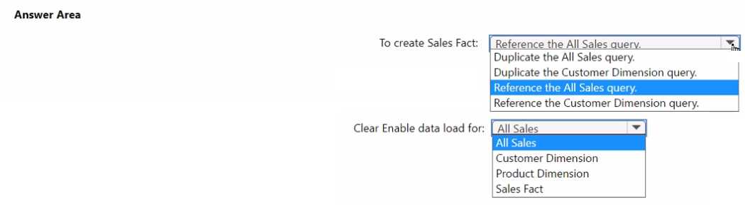
I’d create Sales Fact by referencing All Sales to keep everything linked and updated. Then, clear Enable Load on All Sales to avoid loading the raw data twice—less clutter and simpler upkeep.
Creating the Sales Fact query by referencing All Sales makes sure any updates in the source get reflected automatically without extra steps. Disabling Enable Load on the original All Sales query prevents it from loading twice, which keeps the dataset clean and reduces maintenance work. So, reference All Sales for the fact table and turn off loading on the All Sales query itself. That’s the simplest way to meet the requirements here.
Option A doesn't make much sense because summing sales_id values isn’t meaningful—they’re just identifiers, not numbers you’d total. Calculated columns (B and D) are static and won’t react to filters or slicers, which is usually important for reports. So, a measure that counts rows dynamically (C) seems like the only practical choice here to reflect the current filtered data accurately.
It’s C; calculated columns won’t change with slicers or filters anyway.
HOTSPOT You have a column named UnitslnStock as shown in the following exhibit. 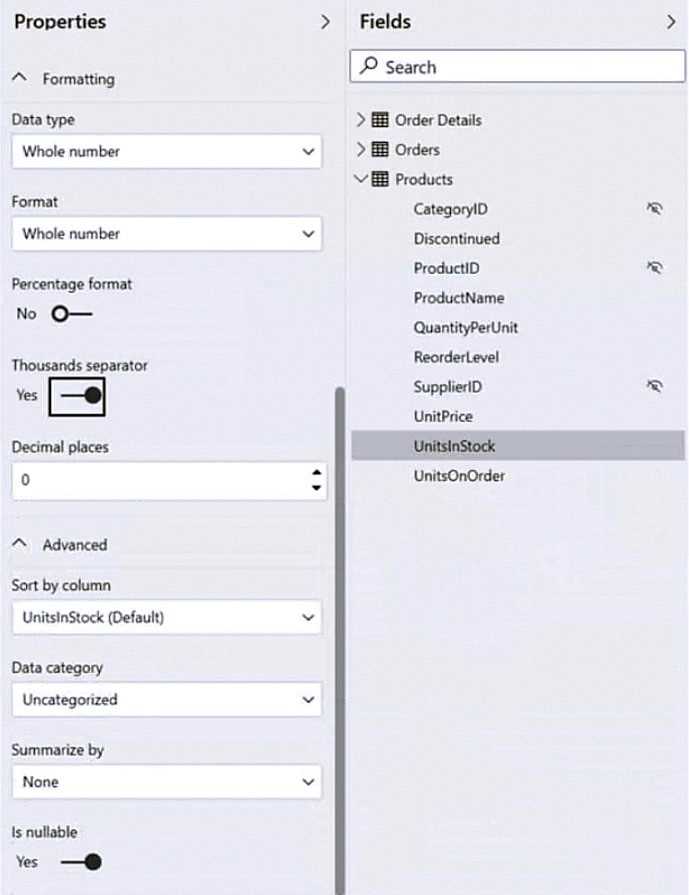 UnitsInStock has 75 non-null values, of which 51 are unique. Use the drop-down menus to select the answer choice that completes each statement based on the information presented in the graphic. NOTE: Each correct selection is worth one point.
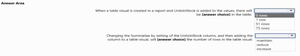
With 51 unique values among 75, there’s a lot of variety, making mode less useful. Median might better represent the center since it’s less affected by any extreme values than the mean would be.
Since there are 75 values and 51 unique ones, the data isn’t tightly clustered, so mode or median might not represent it well. I’d focus more on mean or just acknowledge the spread for better context.
have the same slicers. You need to ensure that all the filters applied to Page1 apply to Page1 and
Page3 only. What should you do?
A. Syncing slicers is designed to share filter selections across specific pages only. It’s a cleaner solution than hiding slicers or tweaking interactions, which don’t limit filter scope effectively.
A syncing slicers on Page1 and Page3 makes sure the filter selections apply only to those pages since Page2’s slicers aren’t linked. That should isolate the filtering as needed.
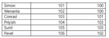
Each employee has one manager as shown in the ParentEmployeelD column,
All reporting paths lead to the CEO at the top of the organizational hierarchy.
You need to create a calculated column that returns the count of levels from each employee to the
CEO.
Which DAX expression should you use?
D imo, because it also uses PATHLENGTH but with a different context that might better handle CEO as level 1 instead of 0. That subtlety could matter depending on how they want levels counted.
Option C also uses PATHLENGTH, which is specifically made to count the number of steps in a hierarchy path. That’s exactly what we need to find the level count from employee to CEO.
line chart named Sales by month.
You pin the Sales by month visual to Dashboard1.
In Report1, you change the Sales by month visual to a bar chart.
You need to ensure that bar chart displays on Dashboard1.
What should you do?
Option B doesn’t really update the visual type, it just refreshes data. So even if you refresh visuals on Dashboard1, the chart stays a line chart unless you repin the new bar chart.
A imo, editing the dashboard tile details won’t update the visual type itself, so that won’t switch from line to bar chart on Dashboard1. You gotta repin or use option C for the change to show.
HOTSPOT You need to design the data model and the relationships for the Customer Details worksheet and the Orders table by using Power BI. The solution must meet the report requirements. For each of the following statement, select Yes if the statement is true, Otherwise, select No. NOTE: Each correct selection is worth one point. 
If CustomerID isn't unique in Customer Details, then any statement claiming a one-to-many relationship from Customers to Orders should be No. Uniqueness is key for that link to work properly.
If CustomerID isn't unique in Customer Details, then the one-to-many relationship might not hold, so any statements assuming uniqueness should be No. Otherwise, the typical setup is one-to-many from Customers to Orders.
You need to ensure that Modell is refreshed on the first day of each month to include last month's
sales dat
a. What should you configure?
D/C? Scheduled refresh (D) handles timing, but incremental refresh (C) ensures only last month’s data updates, which might be what they want to save time. Depends if efficiency or timing is the main goal.
D vs A? D makes sense for setting the refresh timing, but if your data source is on-premises, you’ll also need A to enable that scheduled refresh to actually run. So strictly speaking, setting up a scheduled refresh (D) handles the timing, but without the gateway (A) for on-prem data, the refresh won’t succeed. If it’s cloud data only, then D alone is fine. The question doesn’t specify data location, so both could be relevant depending on context.
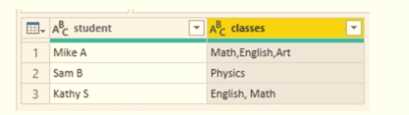
You need to configure the query to display the data as shown in the following exhibit.
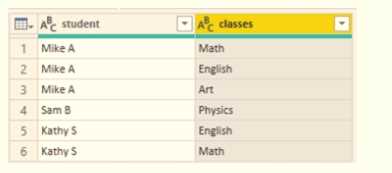
Which step should you use in the query?
B tbh doesn’t feel right since unpivoting usually turns columns into rows, but here they want to separate a single column into multiple class columns. A’s delimiter is off, so it probably fails. D relies on fixed character positions which is risky if the data isn’t uniform. C is the only one that splits by commas which matches the data format shown in the second image, so that makes the most sense to me.
Maybe D works since it splits the column by fixed positions, which could help if the classes are consistently formatted in fixed-width fields. The other options either try to split by commas or unpivot, but if the data's layout is more about fixed character lengths, D might actually produce cleaner columns matching the target output. It’s worth considering if commas aren’t reliable delimiters in this case.
regions.
You need to add an element to the report that will enable users to filter the sales data to include only
a selected region.
Which two elements achieve the goal? Each correct answer presents a complete solution.
NOTE: Each correct selection is worth one point.
It’s A and C. Slicers are the straightforward way to filter visuals on the same page, and tables allow selection that filters other visuals too if cross-filtering is enabled. Drillthrough (B) won’t work here since it jumps to a different page, and cards or KPIs (D and E) don’t provide filtering capabilities at all. So, sticking with slicers and tables makes the most sense for this scenario.
A/C? Slicers are the obvious choice since they’re meant for filtering directly. Tables can filter other visuals through cross-filtering, so they also let users select a region and filter the chart without switching pages. Drillthrough (B) doesn’t work here because it sends you to a different page, and cards or KPIs just display data, not filter it. So A and C make the most sense.