Free CompTIA DataX DY0-001 Actual Exam Questions - Question 1 Discussion
SIMULATION
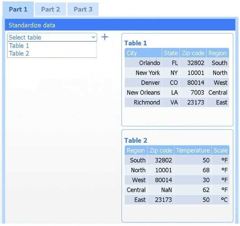
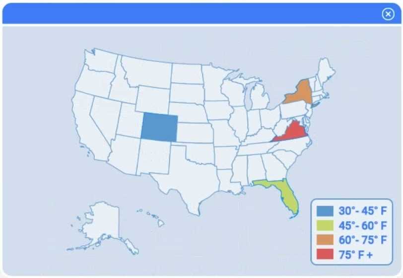
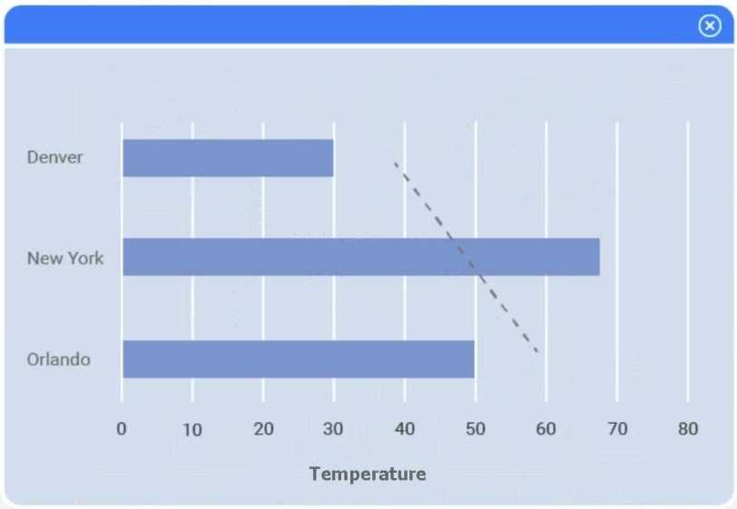
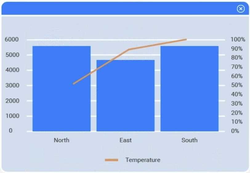
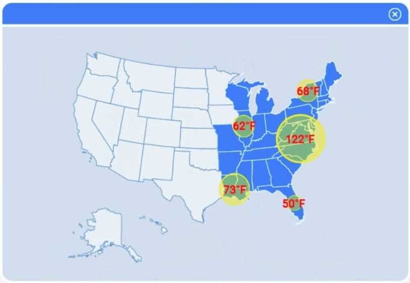
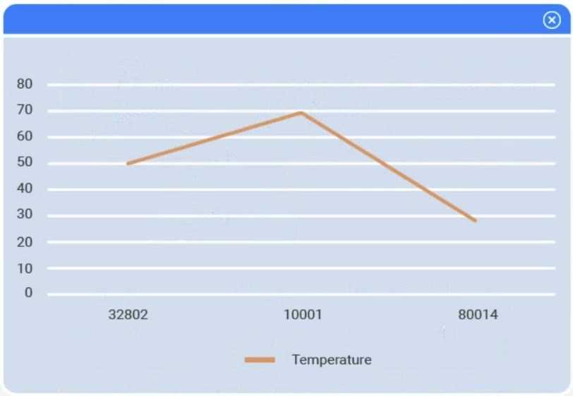
A client has gathered weather data on which regions have high temperatures. The client would like a visualization to gain a better understanding of the data.
INSTRUCTIONS
Part 1
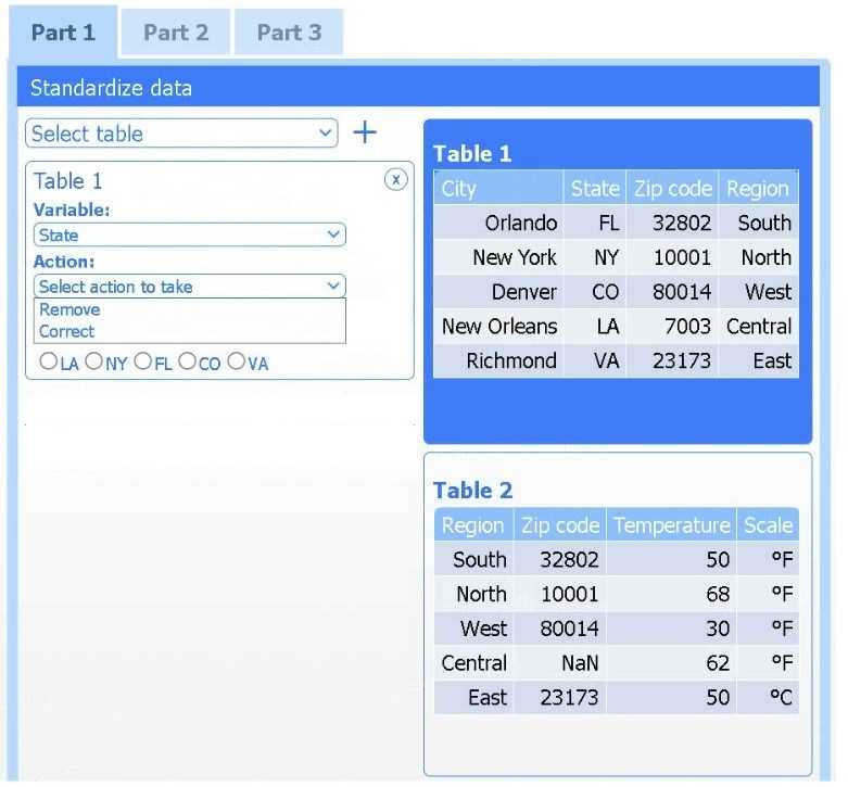
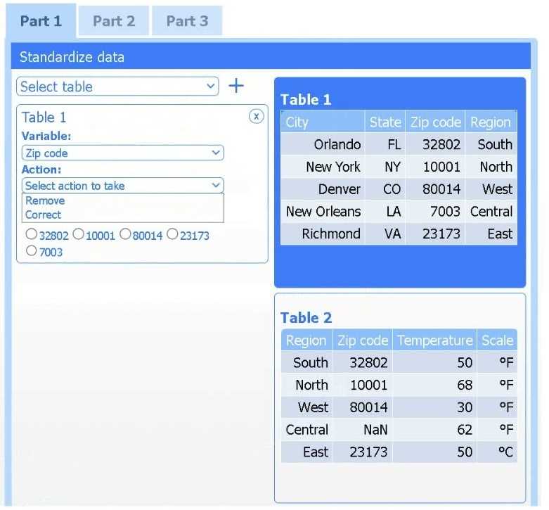
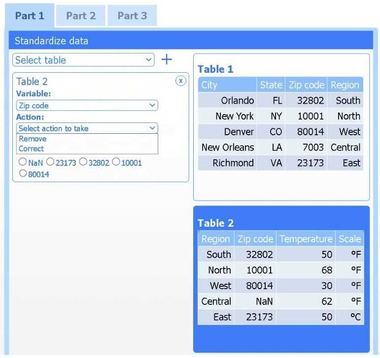
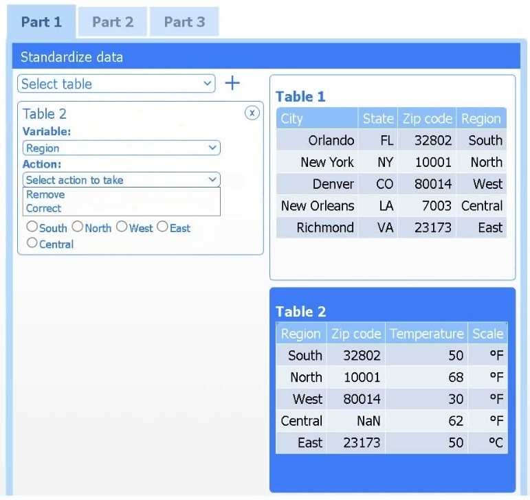
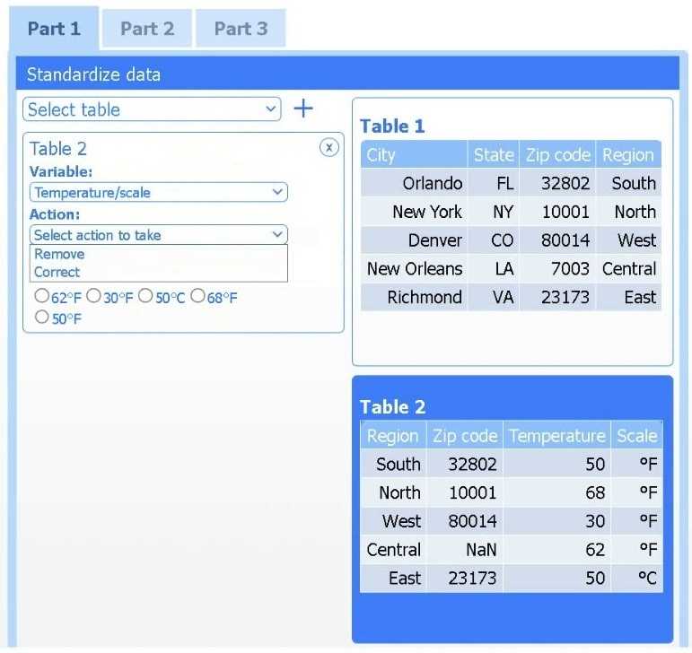
Review the charts provided and use the drop-down menu to select the most appropriate way to standardize the data.
Part 2
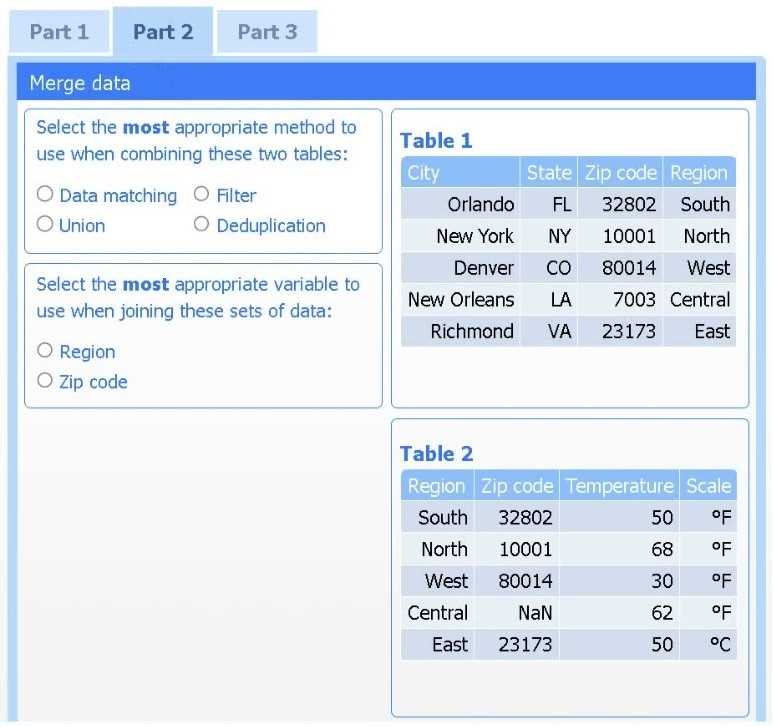
Answer the questions to determine how to create one data set.
Part 3
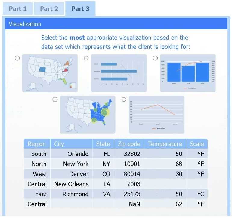
Select the most appropriate visualization based on the data set that represents what the client is looking for.
If at any time you would like to bring back the initial state of the simulation, please click the Reset All button.


I think option D, percentile rank, could work since it shows relative standing without being skewed by extreme highs. That might help the client see which regions are truly hotter compared to others.
I’d exclude min-max (B) since it can squash data too tightly when there are extreme values, making differences less clear. Z-score (C) keeps the spread and highlights which regions really stand out.
Z-score (C) works best here; it evens out extremes unlike min-max (B).
I’d drop option A too since it ignores variability between regions. Z-score (C) is better because it normalizes differences, making comparisons more meaningful across diverse climate zones.
I think option A could be ruled out because it doesn’t address differences in data spread as well as others. Between B and C, if the client wants clear comparisons without focusing on deviations, B might be simpler to interpret.
If outliers exist, z-score (C) might handle them better than min-max (B).
One thing I thought about is skipping standardization entirely if the goal is just to show raw high temps by region for easy comparison, especially if the data ranges are similar. But if we must standardize, option D (log transformation) might help if temperature values are skewed or have a wide range, as it can reduce the impact of extremes without needing to know distribution specifics like z-score requires. It depends on what insight the client wants—are they focusing on relative change or just raw comparisons?
Min-max scaling (B) might be clearer for visual comparison without assuming normal distribution.
I think it’s worth considering the purpose behind the visualization. If the client wants to identify regions with consistently high temperatures relative to their own historical data, standardizing by z-score (C) makes sense because it accounts for how unusual a reading is for each region. Min-max scaling might just flatten differences if some regions have naturally higher ranges. Also, since we don’t know about seasonality or time frames, using a method that controls for variability per region seems safer than raw or simple scaled values. For visualization, a heat map could really highlight t
I’d rule out standardizing by just subtracting the mean (A) since it doesn’t account for variability across regions. Using something like min-max scaling (B) could help if we want all temps on the same scale, making it easier to compare visually.
Z-score helps compare regions by adjusting for local average temps, not just raw numbers.
If the goal is to spot which regions have unusually high temps compared to their usual range, then using a percentile rank could work well. It highlights extremes without getting bogged down in raw values.
For Part 1, I’d say picking a method that accounts for regional differences makes sense—maybe z-score standardization to compare temperatures relative to each area’s average. That way, you spot which regions really stand out instead of just absolute highs. For Part 3, a heat map or choropleth map sounds like the best pick to visualize high temps geographically. It’s straightforward and shows patterns well. This seems clearer than just plotting raw data points or simple bar charts that might miss spatial context.
This question feels super vague without the actual charts or options. Anyone else confused about which standardization method they want here?